Craft Destination

The Ask

Provide merchandising solutions that showcase the core products from Elmer’s brand and encourage creativity during key time periods.

The Solution

Create a destination to serve as a one stop shop for crafting needs; convenient for shoppers to navigate and inspiring for the upcoming crafting occasions and holidays.


Craft Workshoppe

CraftWorkShoppe_EC_Sketch_AR.jpg

The first idea, The Craft Workshoppe came easily. It clearly lends itself to the Holiday season, but could easily be decorated and adjusted to fit the looks for Halloween and Thanksgiving as well. 

Craftopia

Craftopia_EC_Sketch_AR.jpg

The second idea, Craftopia was more challenging. There were six to eight of us in a room working on this. Craft corner…cave… knook… place… City, Craft-opolis, and nothing seemed to inspire the destination we were looking for. And then Craftopia came to me and as soon as I said it aloud the room lit up and the proverbial popcorn of ideas for what Craftopia could be began. 

 
Craft_Endcap_V_sketches.png

End Cap Tight sketches

Drawings by our incredible illustrator, Vitaliy Romanenko, based on my initial sketches.

 
CraftWorkshop_lockup.png

Craft Workshoppe Logo

Developed by the team to be able to flex to different seasons through interchangeable lug-ons.

Craftopia_lockup.png

Craftopia Logo

Designed to be an overarching destination that could potentially be evergrean and carry through any and all seasons and holidays.
Banana Boat Simply Protect

The Ask

Develop artwork for the Banana Boat May FSI to communicate to consumers that Banana Boat Simply Protect sunscreens contain 25% fewer ingredients and still have the same great protection.

The Solution

The first concept utilizes the iconic Banana Boat yellow umbrella as a pie chart to visually show the two characteristics of this new formula, and the second is a impactful twist on a familiar brand treatment where the product is physically blocking the sun for the viewer.

First Reserve Holiday Card

The Ask

Provide 2–3 Holiday eCard concepts ranging from restrained to more playful for the private equity firm First Reserve, which focuses on the energy industry.

The Solutions

I created 3 layouts and included alternate messaging to go along with each concept.

Ribbon

This design uses First Reserve brand colors for a custom holiday ribbon paired with a sans-serif font for a more refined, subtly festive feel

Snowflakes

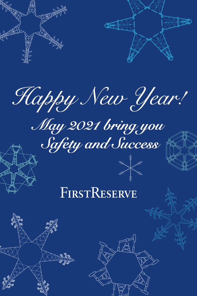
A fun and subtle design utilizing transmission towers and oil wells to create a snowflake pattern alongside a festive script font

Aurora Borealis

This bright illustration based on the First Reserve color palate gives a visually bold approach while tying together seasonality with the energy industry